Visual hierarchy & spacing in webdesign
This post was published 6 years ago. Download links are most likely obsolete. If that's the case, try asking the uploader to re-upload.
Genre: eLearning | MP4 | Video:AVC 1280 x 720| Audio: AAC 48.0 KHz
Language: English | Size: 965 MB | Duration: 1h 10m
First of all thank you for checking out the class i hope you’ll learn something about webdesign. My name is Gil and i’m user interface and user experience designer.
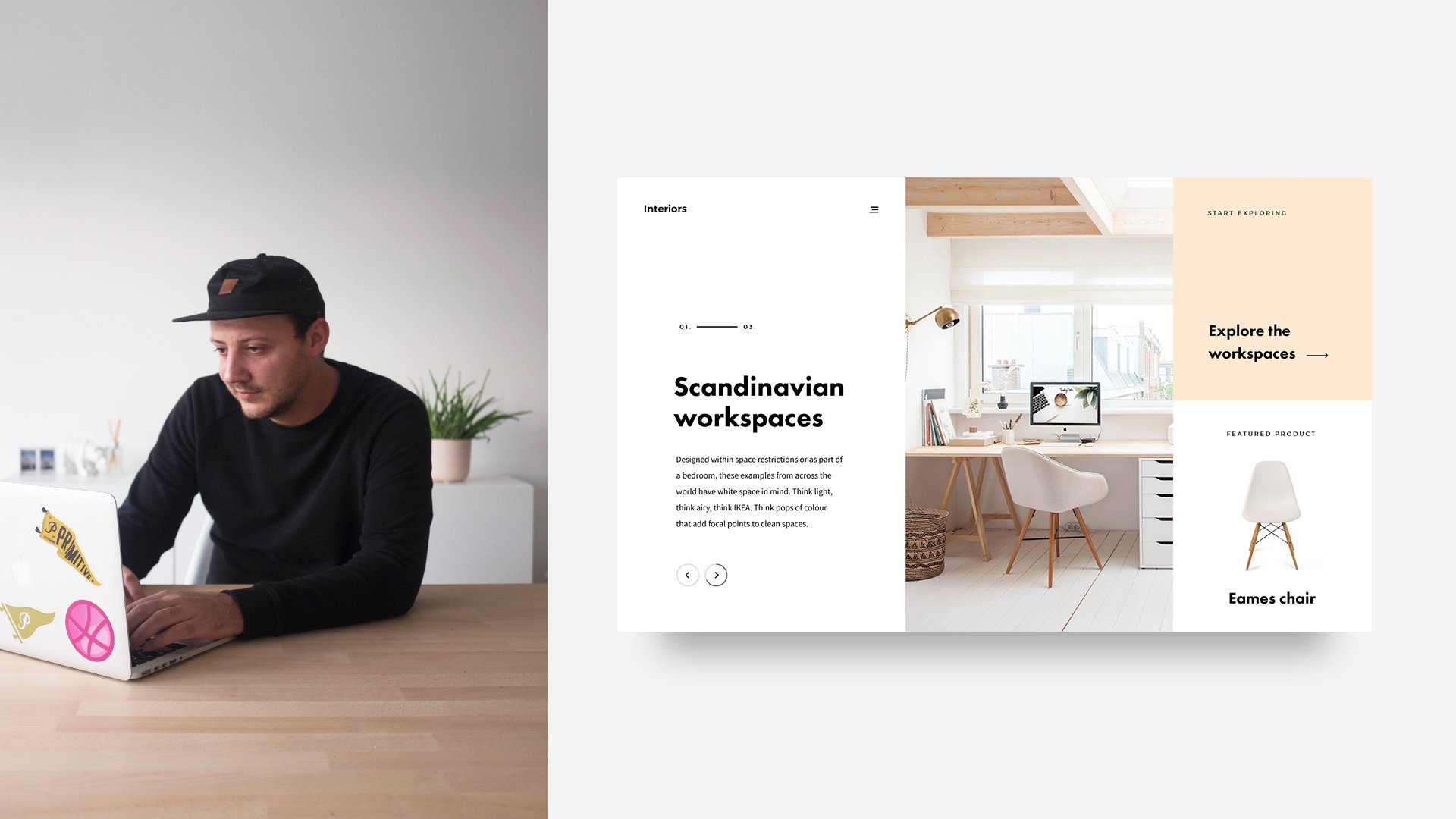
This class is all about visual hierarchy in design and spacing. I’m gonna teach what different ways there are of visual hierarchy and how to use good spacing to come up with a minimal style of webdesign.
First of all i’m gonna do a small part of theory but than we’ll go over to an exercise where I will explain how you can use that theory in your work. This class is for beginning and intermediate designers that already have the basics of photoshop down.
At the end of this class you will have a good understanding of what visual hierarchy and spacing is and you will be able to use that in your work to come up with a minimalis style of webdesign. Let’s get started!
Homepage
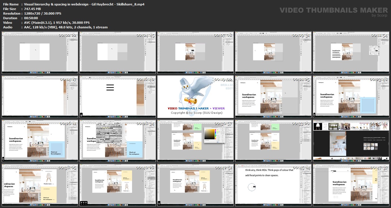
Screenshots
Quick check before we show the links
Helps us keep automated scrapers from hammering the filehosts.