Statistics graphs using Excel
This post was published 6 years ago. Download links are most likely obsolete. If that's the case, try asking the uploader to re-upload.
MP4 | Video: h264, 1280x720 | Audio: AAC, 44.1 KHz, 2 Ch
Genre: eLearning | Language: English + .VTT | Duration: 34 mins | Size: 284 MB
Way to display large amounts of data graphically
What you'll learn
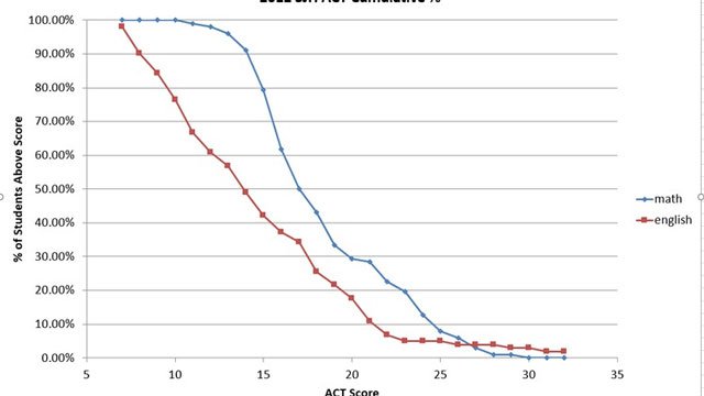
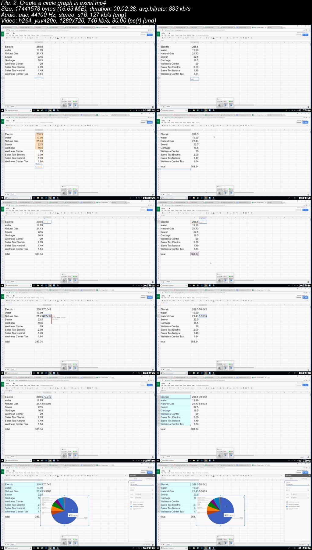
Create box plots, histograms, cumulative percentage graphs.
Requirements
excel software
Description
If you work with large amounts of data, you may want to present data graphically to get your message across quickly and effectively. You will be able to make box plots, histograms, correlation coefficients, pie charts. You can search for my standard deviation video if you want to add some statistical soundness to your presentation.
Who this course is for:
people who work with large amounts of data.
Screenshots
Click Here & Visit My Blog Daily For More Udemy Tutorial. if You Need Update or Links Dead Don't Wait Just PM Me or Leave Comment at This Post
Quick check before we show the links
Helps us keep automated scrapers from hammering the filehosts.